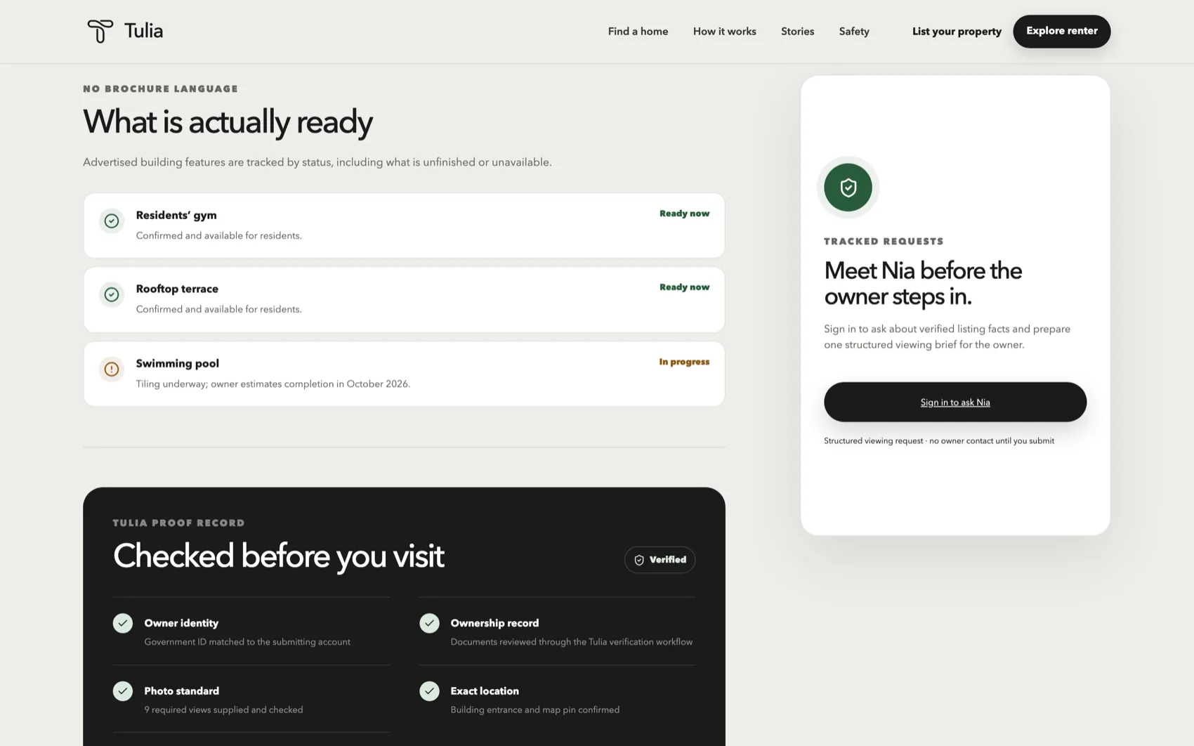
Search with a point of view
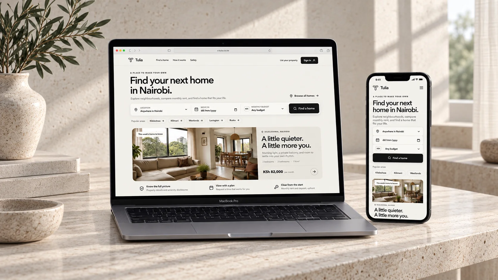
Search filters, neighbourhood cues and editorial listing cards help a renter form a real understanding of a home before opening it.
T-03 / Property marketplace
A rental journey that treats clarity and proof as part of the product experience.
The brief
Tulia needed a rental marketplace that could make the search for a home feel less fragmented. A visitor should be able to understand a listing, compare the practical details and take a sensible next step without decoding the interface.
We used editorial layout and explicit proof records to bring a more considered rhythm to search, property detail and viewing planning.
The response
Search filters, neighbourhood cues and editorial listing cards help a renter form a real understanding of a home before opening it.
Identity, ownership, photo standard and location checks have a place in the product, so confidence is not left to a vague safety claim.
Clear information about the property and the next step lets the viewing journey stay practical, calm and easy to follow.